Science Score: 23.0%
This score indicates how likely this project is to be science-related based on various indicators:
-
○CITATION.cff file
-
✓codemeta.json file
Found codemeta.json file -
○.zenodo.json file
-
○DOI references
-
○Academic publication links
-
✓Committers with academic emails
1 of 2 committers (50.0%) from academic institutions -
○Institutional organization owner
-
○JOSS paper metadata
-
○Scientific vocabulary similarity
Low similarity (9.3%) to scientific vocabulary
Keywords
Repository
Look at data in different ways
Basic Info
Statistics
- Stars: 9
- Watchers: 0
- Forks: 1
- Open Issues: 2
- Releases: 0
Topics
Metadata Files
README.md
dama - Data Manipulator
The dama python library guides you through your data and translates between different representations. Its aim is to offer a consistant and pythonic way to handle different datasaets and translations between them. A dataset can for instance be simple colum/row data, or it can be data on a grid.
One of the key features of dama is the seamless translation from one data represenation into any other.
Convenience pyplot plotting functions are also available, in order to produce standard plots without any hassle.
Installation
pip install dama
Getting Started
python
import numpy as np
import dama as dm
Grid Data
GridData is a collection of individual GridArrays. Both have a defined grid, here we initialize the grid in the constructor through simple keyword arguments resulting in a 2d grid with axes x and y
python
g = dm.GridData(x = np.linspace(0,3*np.pi, 30),
                y = np.linspace(0,2*np.pi, 20),
               )
Filling one array with some sinusoidal functions, called a here
python
g['a'] = np.sin(g['x']) * np.cos(g['y'])
As a shorthand, we can also use attributes instead of items:
python
g.a = np.sin(g.x) * np.cos(g.y)
in 1-d and 2-d they render as html in jupyter notebooks
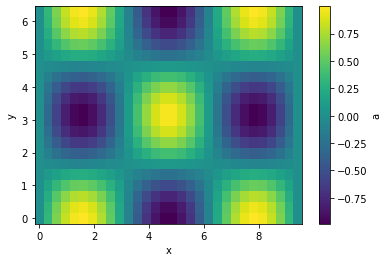
It can be plotted easily in case of 1-d and 2-d grids
python
g.plot(cbar=True);
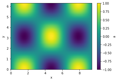
Let's interpolate the values to 200 points along each axis and plot
python
g.interp(x=200, y=200).plot(cbar=True);
Executions of (most) translation methods is lazy. That means that the computation only happens if a specific variable is used. This can have some side effects, that when you maipulate the original data before the translation is evaluated. just something to be aware of.
Masking, and item assignement also is supported
python
g.a[g.a > 0.3]
| y \ x | 0 | 0.325 | 0.65 | ... | 8.77 | 9.1 | 9.42 |
| 0 | -- | 0.319 | 0.605 | ... | 0.605 | 0.319 | -- |
| 0.331 | -- | 0.302 | 0.572 | ... | 0.572 | 0.302 | -- |
| 0.661 | -- | -- | 0.478 | ... | 0.478 | -- | -- |
| ... | ... | ... | ... | ... | ... | ... | ... |
| 5.62 | -- | -- | 0.478 | ... | 0.478 | -- | -- |
| 5.95 | -- | 0.302 | 0.572 | ... | 0.572 | 0.302 | -- |
| 6.28 | -- | 0.319 | 0.605 | ... | 0.605 | 0.319 | -- |
The objects are also numpy compatible and indexable by index (integers) or value (floats). Numpy functions with axis keywords accept either the name(s) of the axis, e.g. here x and therefore is independent of axis ordering, or the usual integer indices.
python
g[10::-1, :np.pi:2]
| y \ x | 3.25 | 2.92 | 2.6 | ... | 0.65 | 0.325 | 0 |
| 0 | a = -0.108 | a = 0.215 | a = 0.516 | ... | a = 0.605 | a = 0.319 | a = 0 |
| 0.661 | a = -0.0853 | a = 0.17 | a = 0.407 | ... | a = 0.478 | a = 0.252 | a = 0 |
| 1.32 | a = -0.0265 | a = 0.0528 | a = 0.127 | ... | a = 0.149 | a = 0.0784 | a = 0 |
| 1.98 | a = 0.0434 | a = -0.0864 | a = -0.207 | ... | a = -0.243 | a = -0.128 | a = -0 |
| 2.65 | a = 0.0951 | a = -0.189 | a = -0.453 | ... | a = -0.532 | a = -0.281 | a = -0 |
python
np.sum(g[10::-1, :np.pi:2].T, axis='x')
| y | 0 | 0.661 | 1.32 | 1.98 | 2.65 |
| a | 6.03 | 4.76 | 1.48 | -2.42 | -5.3 |
Comparison
As comparison to point out the convenience, an alternative way without using dama to achieve the above would look something like the follwoing for creating and plotting the array:
``` x = np.linspace(0,3np.pi, 30) y = np.linspace(0,2np.pi, 20)
xx, yy = np.meshgrid(x, y) a = np.sin(xx) * np.cos(yy)
import matplotlib.pyplot as plt
xwidths = np.diff(x) xpixelboundaries = np.concatenate([[x[0] - 0.5*xwidths[0]], x[:-1] + 0.5x_widths, [x[-1] + 0.5xwidths[-1]]]) ywidths = np.diff(y) ypixelboundaries = np.concatenate([[y[0] - 0.5y_widths[0]], y[:-1] + 0.5ywidths, [y[-1] + 0.5*ywidths[-1]]])
pc = plt.pcolormesh(xpixelboundaries, ypixelboundaries, a) plt.gca().setxlabel('x') plt.gca().setylabel('y') cb = plt.colorbar(pc) cb.set_label('a') ```
and for doing the interpolation:
``` from scipy.interpolate import griddata
interpx = np.linspace(0,3*np.pi, 200) interpy = np.linspace(0,2*np.pi, 200)
gridx, gridy = np.meshgrid(interpx, interpy)
points = np.vstack([xx.flatten(), yy.flatten()]).T values = a.flatten()
interpa = griddata(points, values, (gridx, grid_y), method='cubic') ```
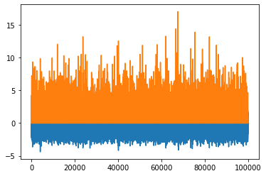
PointData
Another representation of data is PointData, which is not any different of a dictionary holding same-length nd-arrays or a pandas DataFrame (And can actually be instantiated with those).
python
p = dm.PointData()
p.x = np.random.randn(100_000)
p.a = np.random.rand(p.size) * p.x**2
python
p
| x | 0.0341 | 0.212 | 0.517 | ... | 1.27 | 0.827 | 1.57 |
| a | 0.00106 | 0.035 | 0.18 | ... | 1.59 | 0.246 | 0.201 |
python
p.plot()
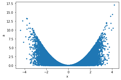
Maybe a correlation plot would be more insightful:
python
p.plot('x', 'a', '.');
This can now seamlessly be translated into Griddata, for example taking the data binwise in x in 20 bins, and in each bin summing up points:
python
p.binwise(x=20).sum()
| x | [-4.392 -3.962] | [-3.962 -3.532] | [-3.532 -3.102] | ... | [2.916 3.346] | [3.346 3.776] | [3.776 4.206] |
| a | 29 | 131 | 456 | ... | 631 | 163 | 77.7 |
python
p.binwise(x=20).sum().plot();
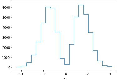
This is equivalent of making a weighted histogram, while the latter is faster.
python
p.histogram(x=20).a
| x | [-4.392 -3.962] | [-3.962 -3.532] | [-3.532 -3.102] | ... | [2.916 3.346] | [3.346 3.776] | [3.776 4.206] |
| 29 | 131 | 456 | ... | 631 | 163 | 77.7 |
python
np.allclose(p.histogram(x=10).a, p.binwise(x=10).sum().a)
True
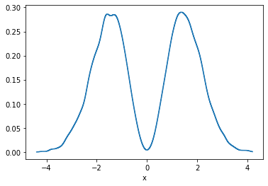
There is also KDE in n-dimensions available, for example:
python
p.kde(x=1000).a.plot();
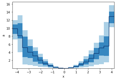
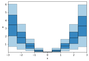
GridArrays can also hold multi-dimensional values, like RGB images or here 5 values from the percentile function. Let's plot those as bands:
python
p.binwise(x=20).quantile(q=[0.1, 0.3, 0.5, 0.7, 0.9]).plot_bands()
When we specify x with an array, we e gives a list of points to binwise. So the resulting plot will consist of points, not bins.
python
p.binwise(x=np.linspace(-3,3,10)).quantile(q=[0.1, 0.3, 0.5, 0.7, 0.9]).plot_bands(lines=True, filled=True, linestyles=[':', '--', '-'], lw=1)
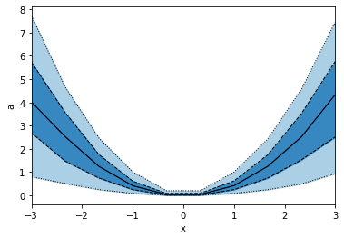
This is not the same as using edges as in the example below, hence also the plots look different.
python
p.binwise(x=dm.Edges(np.linspace(-3,3,10))).quantile(q=[0.1, 0.3, 0.5, 0.7, 0.9]).plot_bands(lines=True, filled=True, linestyles=[':', '--', '-'], lw=1)
Saving and loading
Dama supports the pickle protocol, and objects can be stored like:
python
dm.save("filename.pkl", obj)
And read back like:
python
obj = dm.read("filename.pkl")
Example gallery
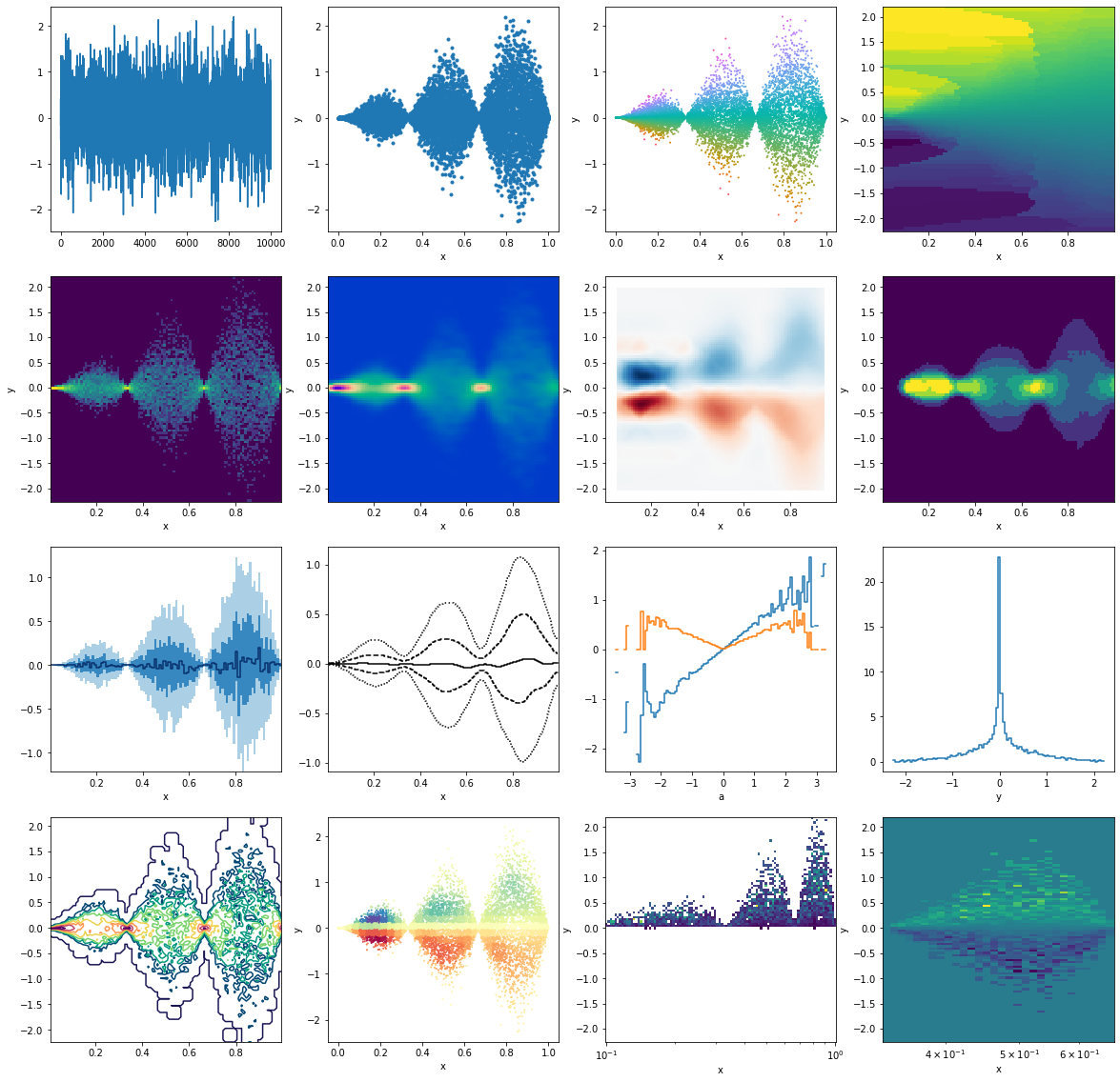
This is just to illustrate some different, seemingly random applications, resulting in various plots. All starting from some random data points
python
from matplotlib import pyplot as plt
python
p = dm.PointData()
p.x = np.random.rand(10_000)
p.y = np.random.randn(p.size) * np.sin(p.x*3*np.pi) * p.x
p.a = p.y/p.x
```python fig, ax = plt.subplots(4,4,figsize=(20,20)) ax = ax.flatten()
First row
p.y.plot(ax=ax[0]) p.plot('x', 'y', '.', ax=ax[1]) p.plot_scatter('x', 'y', c='a', s=1, cmap=dm.cm.spectrum, ax=ax[2]) p.interp(x=100, y=100, method="nearest").a.plot(ax=ax[3])
Second row
np.log(1 + p.histogram(x=100, y=100).counts).plot(ax=ax[4]) p.kde(x=100, y=100, bw=(0.02, 0.05)).density.plot(cmap=dm.cm.afterburnerr, ax=ax[5]) p.histogram(x=10, y=10).interp(x=100,y=100).a.plot(cmap="RdBu", ax=ax[6]) p.histogram(x=100, y=100).counts.medianfilter(10).plot(ax=ax[7])
Third row
p.binwise(x=100).quantile(q=[0.1, 0.3, 0.5, 0.7, 0.9]).y.plotbands(ax=ax[8]) p.binwise(x=100).quantile(q=[0.1, 0.3, 0.5, 0.7, 0.9]).y.gaussianfilter((2.5,0)).interp(x=500).plot_bands(filled=False, lines=True, linestyles=[':', '--', '-'],ax=ax[9]) p.binwise(a=100).mean().y.plot(ax=ax[10]) p.binwise(a=100).std().y.plot(ax=ax[10]) p.histogram(x=100, y=100).counts.std(axis='x').plot(ax=ax[11])
Fourth row
np.log(p.histogram(x=100, y=100).counts + 1).gaussianfilter(0.5).plotcontour(cmap=dm.cm.passionr, ax=ax[12]) p.histogram(x=30, y=30).gaussianfilter(1).lookup(p).plot_scatter('x', 'y', 'a', 1, cmap='Spectral', ax=ax[13]) h = p.histogram(y=100, x=np.logspace(-1,0,100)).a.T h[h>0].plot(ax=ax[14]) h[1/3:2/3].plot(ax=ax[15]) ```
<matplotlib.collections.QuadMesh at 0x7f8a0315d1f0>
```python
```
Owner
- Name: Philipp Eller
- Login: philippeller
- Kind: user
- Location: Munich
- Company: Origins Data Science Lab
- Website: https://philippeller.github.io/
- Repositories: 31
- Profile: https://github.com/philippeller
GitHub Events
Total
- Watch event: 1
Last Year
- Watch event: 1
Committers
Last synced: 12 months ago
Top Committers
| Name | Commits | |
|---|---|---|
| Philipp Eller | p****s@g****m | 287 |
| Aaron Fienberg | a****g@p****u | 2 |
Committer Domains (Top 20 + Academic)
Issues and Pull Requests
Last synced: 10 months ago
All Time
- Total issues: 6
- Total pull requests: 5
- Average time to close issues: 6 months
- Average time to close pull requests: about 3 hours
- Total issue authors: 1
- Total pull request authors: 2
- Average comments per issue: 0.0
- Average comments per pull request: 0.2
- Merged pull requests: 4
- Bot issues: 0
- Bot pull requests: 0
Past Year
- Issues: 0
- Pull requests: 0
- Average time to close issues: N/A
- Average time to close pull requests: N/A
- Issue authors: 0
- Pull request authors: 0
- Average comments per issue: 0
- Average comments per pull request: 0
- Merged pull requests: 0
- Bot issues: 0
- Bot pull requests: 0
Top Authors
Issue Authors
- philippeller (6)
Pull Request Authors
- philippeller (3)
- atfienberg (2)
Top Labels
Issue Labels
Pull Request Labels
Packages
- Total packages: 1
-
Total downloads:
- pypi 21 last-month
- Total dependent packages: 0
- Total dependent repositories: 1
- Total versions: 6
- Total maintainers: 1
pypi.org: dama
Look at data in different ways
- Homepage: https://github.com/philippeller/dama
- Documentation: https://dama.readthedocs.io/
- License: Apache 2.0
-
Latest release: 0.4.8
published almost 2 years ago
Rankings
Maintainers (1)
Dependencies
- KDEpy *
- matplotlib >=2.0
- numpy >=1.11
- numpy_indexed *
- scipy >=0.17
- tabulate *
- actions/checkout v1 composite
- actions/setup-python v1 composite