Recent Releases of sacpy
sacpy - ZenodoAug5
SACPY -- A Python Package for Statistical Analysis of Climate
Sacpy, an effecient Statistical Analysis tool for Climate and Meteorology data.
Author : Zilu Meng
e-mail : zilumeng@uw.edu
github : https://github.com/ZiluM/sacpy
pypi : https://pypi.org/project/sacpy/
Document: https://zilum.github.io/sacpy/
version : 0.0.20
Why choose Sacpy?
Fast!
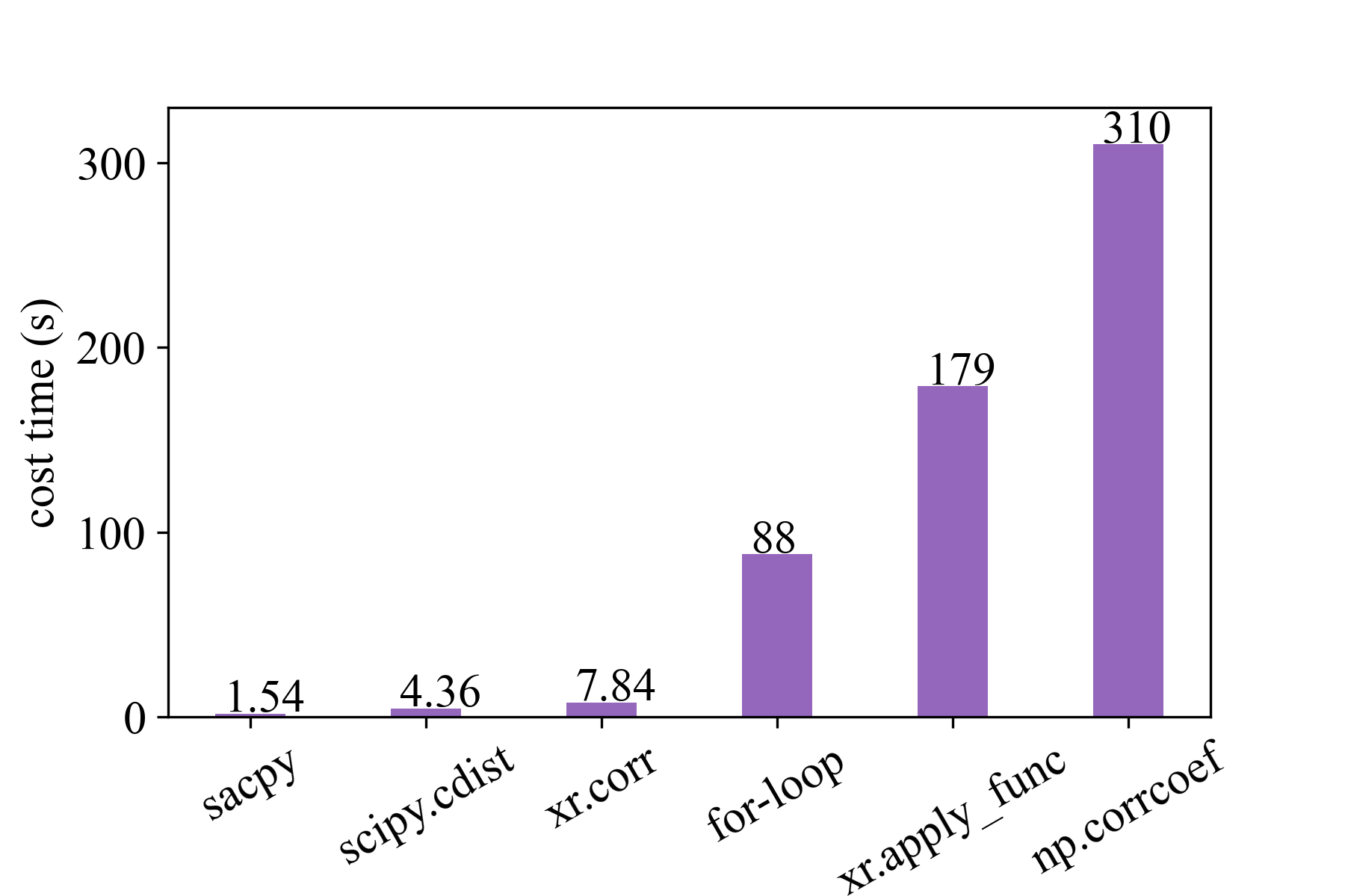
For example, Sacpy is more than 60 times faster than the traditional regression analysis with Python (see speed test). The following is the time spent performing the same task. Sacpy is fastest.
Turn to climate data customization!
Compatible with commonly used meteorological calculation libraries such as numpy and xarray.
Concise code
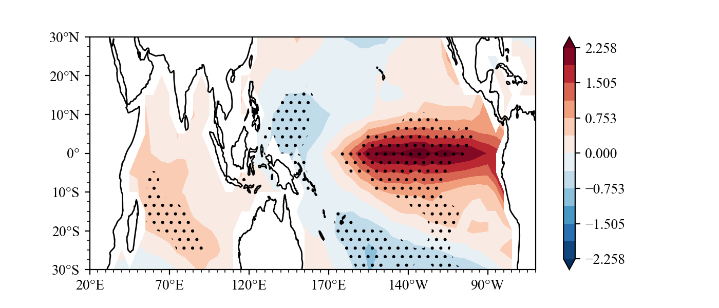
You can finish drawing a following figure with just seven lines of code. see examples of concise.
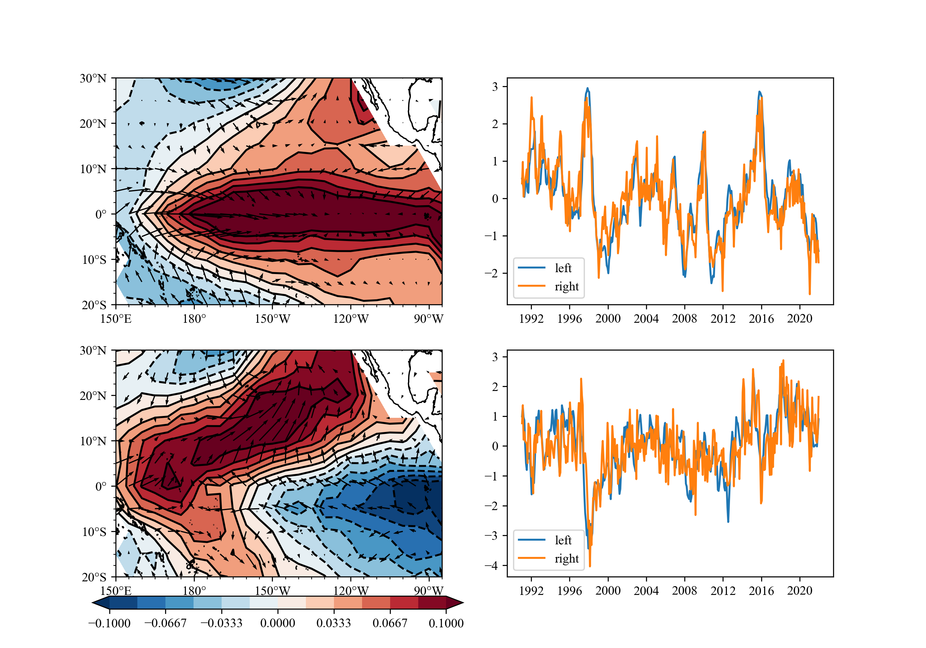
You can use SVD/MCA to get the image below easily.
Install and update
You can use pip to install.
pip install sacpy
Or you can visit https://gitee.com/zilum/sacpy/tree/main/dist to download .whl file, then
pip install .whl_file
update:
pip install --upgrade sacpy
or you can download .whl file and then install use pip install .whl_file.
Speed
As a comparison, we use the corr function in the xarray library, corrcoef function in numpy library, cdist in scipy, apply_func in xarray and for-loop. The time required to calculate the correlation coefficient between SSTA and nino3.4 for 50 times is shown in the figure below.
It can be seen that we are four times faster than scipy cdist, five times faster than xarray.corr, 60 times faster than forloop, 110 times faster than xr.apply_func and 200 times faster than numpy.corrcoef.
Moreover, xarray and numpy can not return the p value. We can simply check the pvalue attribute of sacpy to get the p value.
All in all, if we want to get p-value and correlation or slope, we only to choose Sacpy is 60 times faster than before.
Example
example1
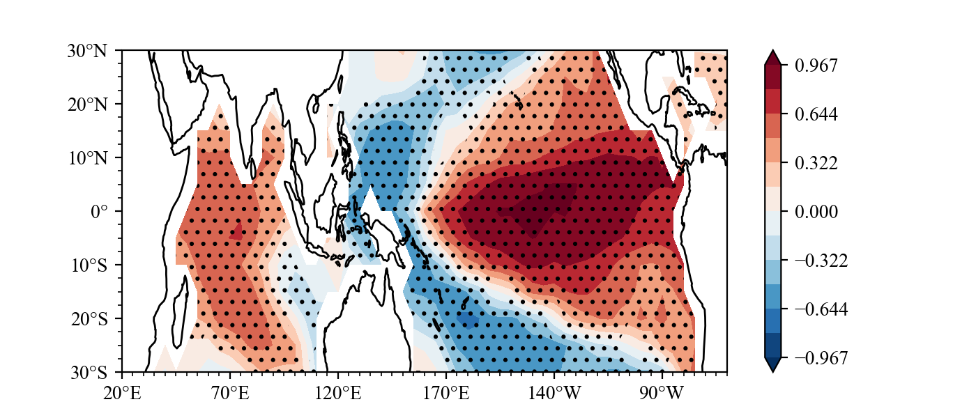
Calculate the correlation between SST and nino3.4 index
```Python import numpy as np import scapy as scp import matplotlib.pyplot as plt import sacpy.Map # need cartopy or you can just not import import cartopy.crs as ccrs
load sst
sst = scp.load_sst()['sst']
get ssta (method=1, Remove linear trend;method=0, Minus multi-year average)
ssta = scp.get_anom(sst,method=1)
calculate Nino3.4
Nino34 = ssta.loc[:,-5:5,190:240].mean(axis=(1,2))
regression
linreg = scp.LinReg(Nino34,ssta)
plot
fig = plt.figure(figsize=[7, 3]) ax = plt.axes(projection=ccrs.PlateCarree(central_longitude=180)) lon ,lat = ssta.lon , ssta.lat
shading
m = ax.scontourf(lon,lat,linreg.corr)
significant plot
n = ax.sigplot(lon,lat,linreg.pvalue,color="k",marker="..")
initialize map
ax.init_map(stepx=50, ysmall=2.5)
colorbar
plt.colorbar(m)
save
plt.savefig("../pic/nino34.png",dpi=200)
```
Result(For a detailed drawing process, see example):
example2
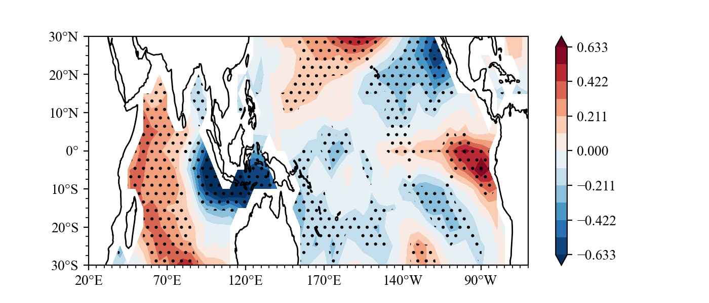
multiple linear regression on Nino3.4 IOD Index and ssta pattern
```Python import numpy as np import scapy as scp import matplotlib.pyplot as plt
load sst
sst = scp.load_sst()['sst']
get ssta (method=1, Remove linear trend;method=0, Minus multi-year average)
ssta = scp.get_anom(sst,method=1)
calculate Nino3.4
Nino34 = ssta.loc[:,-5:5,190:240].mean(axis=(1,2))
calculate IODIdex
IODW = ssta.loc[:,-10:10,50:70].mean(axis=(1,2)) IODE = ssta.loc[:,-10:0,90:110].mean(axis=(1,2)) IODI = +IODW - IODE
get x
X = np.vstack([np.array(Nino34),np.array(IODI)]).T
multiple linear regression
MLR = scp.MultLinReg(X,ssta)
plot IOD's effect
import sacpy.Map import cartopy.crs as ccrs
fig = plt.figure(figsize=[7, 3]) ax = plt.axes(projection=ccrs.PlateCarree(central_longitude=180)) lon ,lat = ssta.lon , ssta.lat m = ax.scontourf(lon,lat,MLR.slope[1])
significant plot
n = ax.sigplot(lon,lat,MLR.pvi[1],color="k",marker="..")
initialize map
ax.init_map(stepx=50, ysmall=2.5) plt.colorbar(m) plt.savefig("../pic/MLR.png",dpi=200) ```
Result(For a detailed drawing process, see example):
example3
What effect will ENSO have on the sea surface temperature in the next summer?
```Python import numpy as np import sacpy as scp import matplotlib.pyplot as plt import xarray as xr
load sst
sst = scp.loadsst()['sst'] ssta = scp.getanom(sst)
calculate Nino3.4
Nino34 = ssta.loc[:,-5:5,190:240].mean(axis=(1,2))
get DJF mean Nino3.4
DJFnino34 = scp.XrTools.specmoth_yrmean(Nino34,[12,1,2])
get JJA mean ssta
JJAssta = scp.XrTools.specmoth_yrmean(ssta, [6,7,8])
regression
reg = scp.LinReg(DJFnino34[:-1], JJAssta)
plot
import cartopy.crs as ccrs import sacpy.Map
fig = plt.figure(figsize=[7, 3]) ax = plt.axes(projection=ccrs.PlateCarree(centrallongitude=180)) lon ,lat = np.array(ssta.lon) , np.array(ssta.lat) m = ax.scontourf(lon,lat,reg.slope) n = ax.sigplot(lon,lat,reg.pvalue,color="k",marker="///") ax.initmap(stepx=50, ysmall=2.5) plt.colorbar(m) plt.savefig("../pic/ENSONextyear_JJA.png",dpi=300)
```
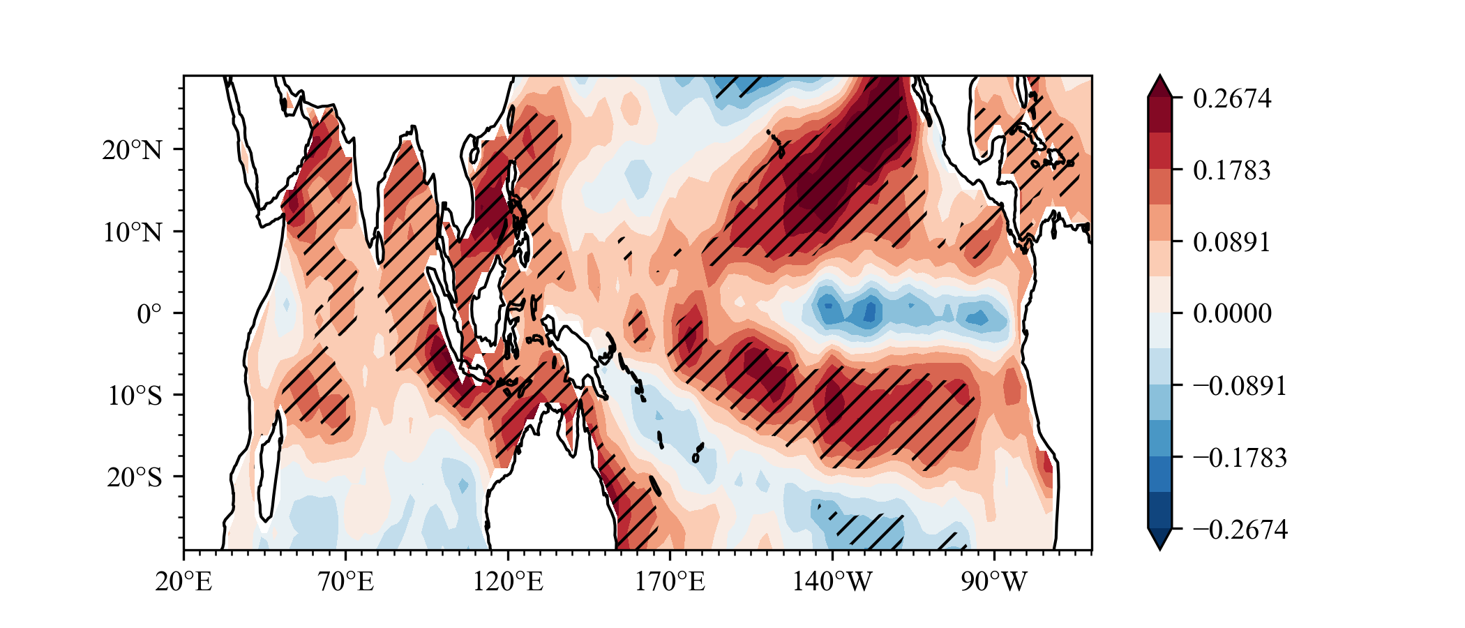
Same as Indian Ocean Capacitor Effect on Indo–Western Pacific Climate during the Summer following El Niño (Xie et al.), the El Nino will lead to Indian ocean warming in next year JJA.
example4
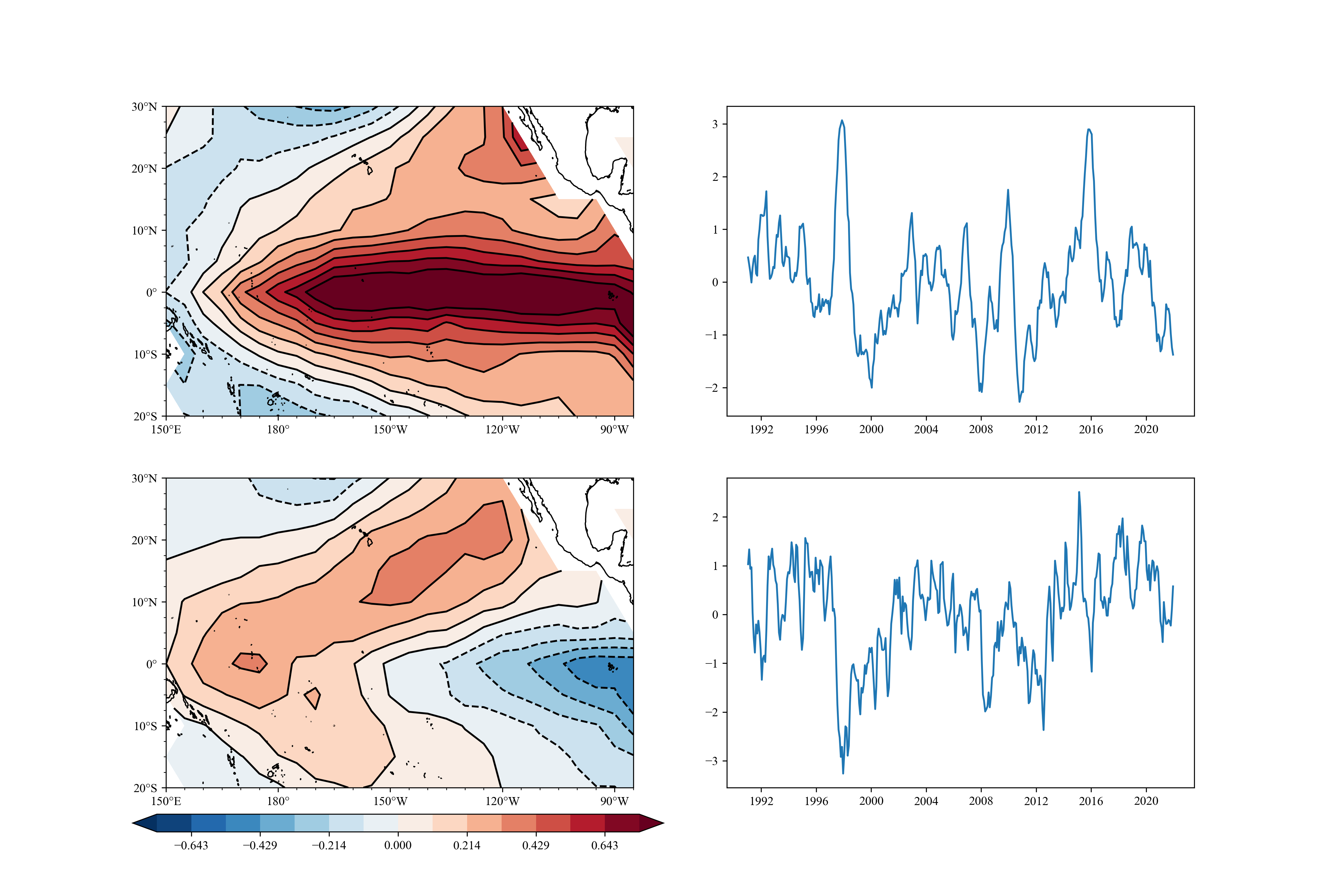
EOF analysis
```Python import sacpy as scp import numpy as np import matplotlib.pyplot as plt
get data
sst = scp.loadsst()["sst"].loc[:, -20:30, 150:275] ssta = scp.getanom(sst)
EOF
eof = scp.EOF(np.array(ssta)) eof.solve()
get spartial pattern and pc
pc = eof.getpc(npt=2) pt = eof.getpt(npt=2)
plot
import cartopy.crs as ccrs import sacpy.Map lon , lat = np.array(ssta.lon) , np.array(ssta.lat) fig = plt.figure(figsize=[15,10]) ax = fig.addsubplot(221,projection=ccrs.PlateCarree(centrallongitude=180)) m1 = ax.scontourf(lon,lat,pt[0,:,:],cmap='RdBur',levels=np.linspace(-0.75,0.75,15),extend="both") ax.scontour(m1,colors="black") ax.initmap(ysmall=2.5)
plt.colorbar(m1)
ax2 = fig.addsubplot(222) ax2.plot(sst.time,pc[0]) ax3 = fig.addsubplot(223,projection=ccrs.PlateCarree(centrallongitude=180)) m2 = ax3.scontourf(lon,lat,pt[1,:,:],cmap='RdBur',levels=np.linspace(-0.75,0.75,15),extend="both") ax3.scontour(m2,colors="black") ax3.initmap(ysmall=2.5) ax4 = fig.addsubplot(224) ax4.plot(sst.time,pc[1]) cbax = fig.addaxes([0.1,0.06,0.4,0.02]) fig.colorbar(m1,cax=cbax,orientation="horizontal") plt.savefig("../pic/eofana.png",dpi=300) ```
example5
Mean value (Composite Analysis) t-test for super El Nino (DJF Nino3.4 > 1)
```Python
import sacpy as scp import numpy as np import matplotlib.pyplot as plt
sst = scp.loadsst()["sst"] ssta = scp.getanom(sst, method=0)
get Dec Jan Feb SSTA
sstadjf = scp.XrTools.specmothyrmean(ssta,[12,1,2]) Nino34 = sstadjf.loc[:, -5:5, 190:240].mean(axis=(1, 2))
select year of Super El Nino
select = Nino34 >= 1 sstasl = sstadjf[select] mean, pv = scp.onemeantest(ssta_sl)
plot
import sacpy.Map import cartopy.crs as ccrs fig = plt.figure(figsize=[7, 3]) ax = plt.axes(projection=ccrs.PlateCarree(centrallongitude=180)) lon ,lat = np.array(ssta.lon) , np.array(ssta.lat) m = ax.scontourf(lon,lat,mean) n = ax.sigplot(lon,lat,pv,color="k",marker="..") ax.initmap(stepx=50, ysmall=2.5) plt.colorbar(m) plt.savefig("../pic/onetest.png") ```
Result:
example6
SVD(MCA) analysis.
```Python import sacpy as scp import xarray as xr import matplotlib.pyplot as plt import numpy as np from xmca import array import sacpy.Map import cartopy.crs as ccrs
load data
sst = scp.loadsst()['sst'].loc["1991":"2021", -20:30, 150:275] ssta = scp.getanom(sst) u = scp.load10mwind()['u'] v = scp.load10mwind()['v']
uua = scp.getanom(u) vua = scp.getanom(v) uv = np.concatenate([np.array(uua)[...,np.newaxis],np.array(vua)[...,np.newaxis]],axis=-1)
calculation
svd = scp.SVD(ssta,uv,complex=False) svd.solve() ptl, ptr = svd.getpt(3) pcl,pcr = svd.getpc(3) upt ,vpt = ptr[...,0] , ptr[...,1] sst_pt = ptl
plot progress, see example/SVD.ipynb
```
result:
examples of concise
If you want to plot example1's figure , you need write:
```Python from cartopy.mpl.ticker import LongitudeFormatter, LatitudeFormatter from matplotlib.ticker import MultipleLocator import cartopy.crs as ccrs plt.rc('font', family='Times New Roman', size=12) ax = plt.axes(projection=ccrs.PlateCarree(centrallongitude=180)) m = ax.contourf(ssta.lon,ssta.lat,linreg.corr, cmap="RdBur", levels=np.linspace(-1, 1, 15), extend="both", transform=ccrs.PlateCarree()) n = plt.contourf(ssta.lon,ssta.lat,linreg.pvalue, levels=[0, 0.05, 1], zorder=1, hatches=['..', None], colors="None", transform=ccrs.PlateCarree()) xtk = np.arange(-180,181,60) ax.setxticks(xtk)
ax.set_xticks(xtk,crs=ccrs.PlateCarree())
ax.setyticks(np.arange(-50,51,20),crs=ccrs.PlateCarree()) ax.yaxis.setmajorformatter(LatitudeFormatter()) ax.xaxis.setmajorformatter(LongitudeFormatter(zerodirectionlabel=True)) ax.xaxis.setminorlocator(MultipleLocator(10)) ax.yaxis.setminorlocator(MultipleLocator(5)) ax.coastlines() ax.setaspect("auto") plt.colorbar(m)
```
So troublesome!!!
But if you import sacpy.Map, you can easily write:
Python
import sacpy.Map
import cartopy.crs as ccrs
fig = plt.figure(figsize=[7, 3])
ax = plt.axes(projection=ccrs.PlateCarree(central_longitude=180))
lon ,lat = ssta.lon , ssta.lat
m = ax.scontourf(lon,lat,rvalue)
n = ax.sig_plot(lon,lat,p,color="k",marker="..")
ax.init_map(stepx=50, ysmall=2.5)
plt.colorbar(m)
How wonderful, how concise !
Acknowledgements
Thank Prof. Feng Zhu (NUIST,https://fzhu2e.github.io/) for his guidance of this project.
Thank for Prof. Tim Li (University of Hawaii at Mānoa, http://iprc.soest.hawaii.edu/people/li.php) ,Prof. Lin Chen (NUIST, https://faculty.nuist.edu.cn/chenlin12/zh_CN/index.htm) and Dr. Ming Sun (NUIST) 's help.
Sepcial thanks: Lifei Lin (Sun Yat-sen University) 's repr_html.py to visualize class in jupyter!
- Python
Published by ZiluM almost 2 years ago
