
seaborn
seaborn: statistical data visualization - Published in JOSS (2021)

CMasher
CMasher: Scientific colormaps for making accessible, informative and 'cmashing' plots - Published in JOSS (2020)

OpenSpace
OpenSpace: An open-source astrovisualization framework - Published in JOSS (2017)

PVGeo
PVGeo: an open-source Python package for geoscientific visualization in VTK and ParaView - Published in JOSS (2019)

The plebeian Graph Library
The plebeian Graph Library: A WebGL based network visualisation and diagnostics package - Published in JOSS (2024)

multiqc
Aggregate results from bioinformatics analyses across many samples into a single report.


pygeohydro
A part of HyRiver software stack for accessing hydrology data through web services


vitessce
Vitessce is a visual integration tool for exploration of spatial single-cell experiments.


khroma
Colour Schemes for Scientific Data Visualization - :exclamation: This is a read-only mirror from https://codeberg.org/tesselle/khroma

forestplot
A Python package to make publication-ready but customizable coefficient plots.

efp-seq_browser
An RNA-Seq data exploration tool that shows read map coverage of a gene of interest along with a coloured "electronic fluorescent pictographic" (eFP) based on its RPKM expression level.

spectrafit
📊📈🔬 SpectraFit is a command-line and Jupyter-notebook tool for quick data-fitting based on the regular expression of distribution functions.

pandas-ai
Chat with your database or your datalake (SQL, CSV, parquet). PandasAI makes data analysis conversational using LLMs and RAG.

xyz2graph
Convert an xyz file into a molecular graph and create a 3D visualisation of the graph.

outset
add zoom indicators, insets, and magnified panels to matplotlib/seaborn visualizations with ease!

pretzel
Javascript full-stack framework for Big Data visualisation and analysis

genome-spy
A visualization grammar and GPU-accelerated toolkit for genomic data

ml-hierarchical-confusion-matrix
Neo: Hierarchical Confusion Matrix Visualization (CHI 2022)


cloupy
CLOUPY IS NO LONGER SUPPORTED. PLEASE, SEE README. cloupy is a Python library for climatological data downloading, processing and visualizing. The main goal of the library is to help its author in writing a BA thesis. The library is well adapted to academic work - used data sources are reliable and graphs are easy to modify.
r-raster-vector-geospatial
Introduction to Geospatial Raster and Vector Data with R
tabula
tabula: An R Package for Analysis, Seriation, and Visualization of Archaeological Count Data - Published in JOSS (2019)

interactive_data_editor
A Software to interactively edit data in a graphical manner
teeplot
organize data visualization output, automatically picking meaningful names based on semantic plotting variables


comparative_ml_analysis_bioinformatics
A comprehensive analysis of gene expression data using machine learning techniques in Python and R, focusing on predictive modeling and data visualization


augur
Python library and web service for Open Source Software Health and Sustainability metrics & data collection. You can find our documentation and new contributor information easily here: https://oss-augur.readthedocs.io/en/main/

python-ecology-lesson
Data Analysis and Visualization in Python for Ecologists

divbrowse
A web application for interactive visualization and exploratory data analysis of variant call matrices


pycirclize
Circular visualization in Python (Circos Plot, Chord Diagram, Radar Chart)

bluecloud-plankton
Spatial interpolation of plankton data using a neural network


fast_dash
Turn your Python functions into interactive apps! Fast Dash is an innovative way to deploy your Python code as interactive web apps with minimal changes.

higlass-scalable-insets
Scalable Insets for HiGlass: a new technique for interactively exploring and navigating large numbers of annotated patterns in multiscale visual spaces such as gigapixel images, matrices, or maps.

Pore2Chip
Pore2Chip: All-in-one python tool for soil microstructure analysis and micromodel design - Published in JOSS (2025)


asc-analysis
DH Scraping and Analyzing the ASC database with Jupyter Notebooks

fern
A human-readable and modifiable data-expression language with minimal clutter.

pyramid_chart
pyramid_chart is a stata user-generated package that produces a population pyramid.

nf-vuegen
nf-core module designed to automate report generation from outputs produced by other modules, subworkflows, or pipelines. VueGen creates reports from bioinformatics outputs, supporting formats like PDF, HTML, DOCX, ODT, PPTX, Reveal.js, Jupyter notebooks, and Streamlit web applications.

digital-atlas
Interface to visualise connections between postcolonial intellectuals
vuegen
VueGen automates the creation of reports from bioinformatics outputs, supporting formats like PDF, HTML, DOCX, ODT, PPTX, Reveal.js, Jupyter notebooks, and Streamlit web applications. Users simply provide a directory with output files and VueGen compiles them into a structured report.

women-of-coal-revisited
This is a text analysis project which utilizes localized oral histories in order to highlight topics, labor trends, and women's history in Appalachian coal mining towns. Original archival sources from the University of Kentucky Nunn Center for Oral History "Appalachia: Women of Coal" Collection & the 1996 Women of Coal primary oral history reader.

digimon-world-survey
Data and R-code for survey conducted about Digimon World 1


survey_dashboard
A dashboard build with bokeh to provide interative data visualization and exploration of survey results.

leaflet-dataclassification
Single-step data classification, symbology and legend creation for GeoJSON data powered thematic maps

cer-beans
CER ⋅ BEANS: Community Engaged Research Balanced Expressions and Assessments with Nuanced Scores

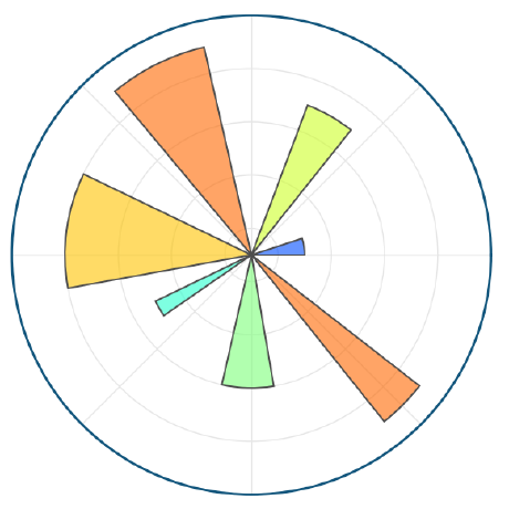
polar-diagrams-for-model-comparison
"Interactive Polar Diagrams for Model Comparison" by Aleksandar Anžel, Dominik Heider, and Georges Hattab

extra-dimensional-muon-anomalies
Quantum Simulation of Extra-Dimensional Contributions to Muon Anomalies
isopleuros
Ternary Plots - :exclamation: This is a read-only mirror from https://codeberg.org/tesselle/isopleuros

rath
Next generation of automated data exploratory analysis and visualization platform.


mdv-climex
An RShiny web application for visualizing high frequency meteorological data and identifying extreme climate events in the McMurdo Dry Valleys of Antarctica.

internet-visualization
Source code of "Towards an interactive visualization of the Internet".

pricepoints
Price Points research, data analyses, and packages. Informational only, not official Turquoise Health products

cancerpainclassifier
The project is in Beta, it will be a library containing modular pipeline tools to train different IA models in order to help the selection treatments for a patient suffering from cancer by reading some Pet scan


ascvit
Repository for the article in the online magazine Towards Data Science.

sus-analysis-toolkit
A web-based analysis toolkit for the System Usability Scale providing calculation, plotting, interpretation and contextualization utility.

active-time-hypothesis
Reimagining Quantum Non-Locality: Simulating Entangled Systems with the Active Time Hypothesis

oscillation-adaptability
🔄 Discover how oscillations emerge as a mathematical necessity in complex systems. A rigorous framework proving C+A=1 with 10^-16 precision. 📊 Visualize adaptability landscapes & spectral fingerprints.

iwac-sentiment-analysis
Interactive visualization of sentiment analysis on the Islam West Africa Collection (IWAC) corpus, comparing ChatGPT vs Gemini with multilingual support and advanced filtering.


top-countries-mentioned-by-donald-trump
🌎 A data visualization project showing the top countries and diplomatic relations mentioned by Donald Trump in his presidential term from 2017 to 2020.(展示唐纳德·特朗普在其2017年至2020年总统任期内提及的国家外交关系的数据可视化。)

metaboheatmap
A R/Shiny based app for visualizing metabolomics data through heatmaps

iet-gpr
MATLAB function set for importing, processing, and plotting data from a GSSI-StructureScan Mini GPR
networks-of-roman-eleusis
A Digital Scholarship Tool for Studying Ancient Epigraphy

datoviz
⚡ Datoviz: high-performance GPU rendering for scientific data visualization

rseb
An R-package for daily tasks required to handle biological data as well as avoid re-coding of small functions for quick but necessary data management.


active-time-hypothesis2
The Active Time Hypothesis: Unveiling Temporal Dynamics in Quantum Entanglement
symphony-binary-confusion-matrix
Symphony: Interactive Data Widgets (CHI 2022)

data-visualization
Building interactive charts and visualizing data with Tableau, R and Python.
teaching
Teaching Materials for Dr. Waleed A. Yousef